





On this page
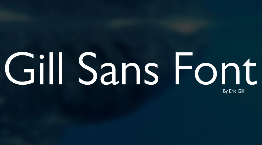
Gill Sans is a commercial humanist sans-serif designed by Eric Gill and released by Monotype in 1928, so we don’t host it. If you want a free font with a similar feel, use Cabin, Lato or Alegreya Sans below. All three are under the SIL Open Font License, which allows commercial use.
History of Gill Sans
Eric Gill was an English sculptor, type designer and painter. Stanley Morison, an influential Monotype executive and a friend of Gill, commissioned the design. The aim was a modern sans-serif that could compete with the German sans-serifs of the 1920s.
Gill wanted a typeface that felt modern but classical at the same time, and he meant it for body text as well as display use. The earlier Underground Alphabet by Edward Johnston, from 1916, was one of its starting points.
The London and North Eastern Railway adopted it soon after release. After the railways were nationalised in 1948, British Railways used it on signs, posters, engine plates and timetables. Over the decades, designers added more weights, widths and variants.
Font characteristics
Gill Sans has open, even letters and a classical balance that suits both headings and body text. Its x-height is smaller than that of most modern sans-serifs, which is one reason it feels elegant at display sizes and less dense at small sizes.
Usage
Gill Sans is used for logos, product design, cards, signs and on-screen text. As a sans-serif, it works for web pages, magazines and newspapers, and it can serve as a title or body font.
Font view


Free fonts that look like Gill Sans
We set each candidate beside Gill Sans MT, the version on our Windows PC, and compared the width of the line “Gill Sans Font Download” at the same size. Cabin is the closest in width: about 3 percent wider at regular weight and about 7 percent narrower at bold. Lato is about 7 percent wider at regular and about 5 percent narrower at bold. Alegreya Sans is about 6 percent narrower at regular and about 16 percent narrower at bold. All three have a larger x-height than Gill Sans MT.
-
Cabin Download font Open in Studio
- Format
- TTF
- Licence
- Free for commercial use
- Made by
- Impallari Type, Rodrigo Fuenzalida
- Source
- fonts.google.com
Gill Sans Font -
- Format
- TTF
- Licence
- Free for commercial use
- Made by
- Łukasz Dziedzic
- Source
- fonts.google.com
Gill Sans Font -
Alegreya Sans Download font Open in Studio
- Format
- TTF
- Licence
- Free for commercial use
- Made by
- Juan Pablo del Peral, HT Fonts
- Source
- fonts.google.com
Gill Sans Font
Type your own text in the box above. Each card shows it in one font, with a download button. For more, try the font generator, or see our roundup of neutral sans-serifs.
How to use a free Gill Sans alternative
On Windows, download the file, right-click it and choose Install. On a Mac, double-click the file and select Install Font in Font Book. Restart your design app if the font does not appear in its list.
Licence
Gill Sans is a commercial typeface, and we don’t host it. Its rights holder sells licences, so check Monotype’s website for terms before you use it in paid work.
Cabin, Lato and Alegreya Sans are under the SIL Open Font License. Each download includes its licence file, so keep it with your project files.
Questions about Gill Sans
No. Gill Sans is a commercial Monotype typeface, and we don’t host it. Cabin, Lato and Alegreya Sans above are free to use.
Eric Gill designed it, and Monotype released it in 1928.
Cabin is the closest in width. In our side-by-side width test it was about 3 percent wider than Gill Sans MT at regular weight and about 7 percent narrower at bold.
Yes. Cabin, Lato and Alegreya Sans are under the SIL Open Font License, which allows commercial use.
Good font for a poster. Love your font collection.