





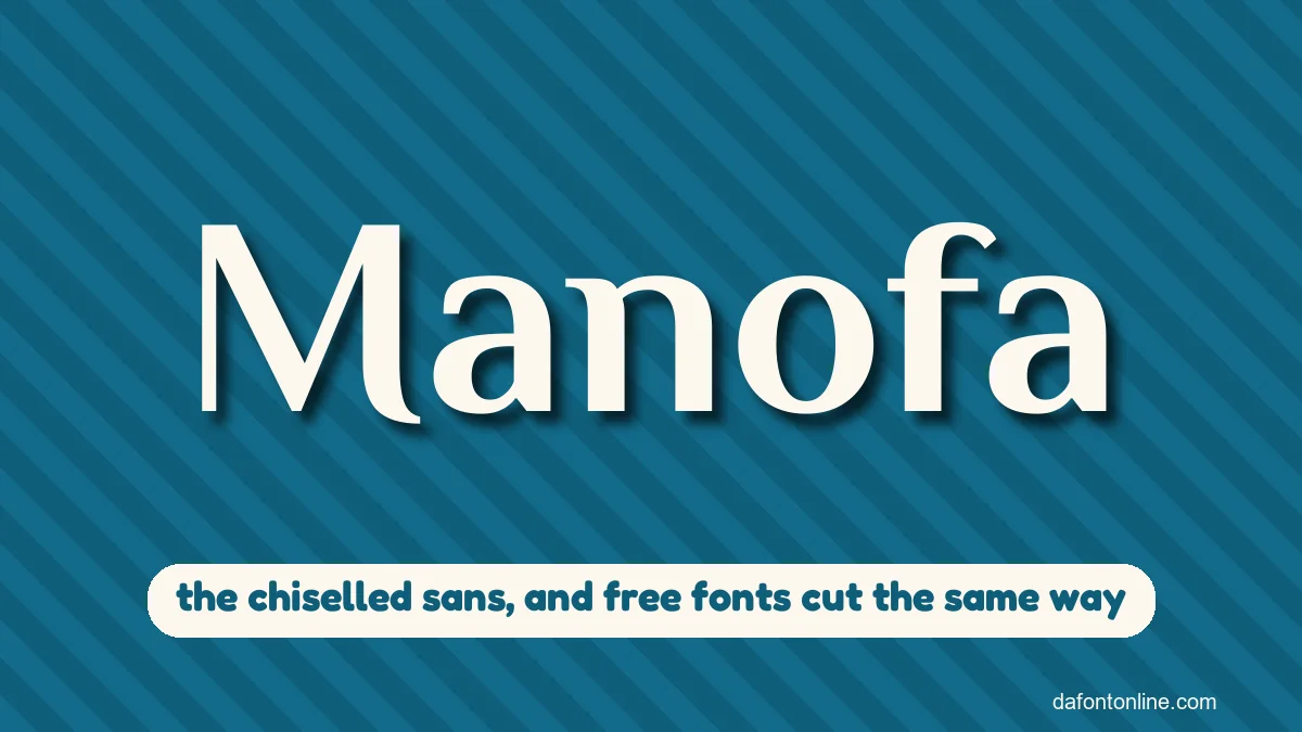
Quick answer: Manofa is a pen-cut, calligraphic sans-serif drawn by Mariya Lish and sold by Inhouse Type, with 16 styles. It’s a paid font with no free version, but if you pay for Adobe Creative Cloud you can already use it through Adobe Fonts. The closest free match is Philosopher, and it downloads below with two more.
On this page
Get Manofa, or a free font that looks like it
Type a headline and it shows in each font, one under another. The first card links to Manofa on Adobe Fonts. The other three are free for commercial use and download from here.
-
Manofa Get it from Inhouse Type
- Format
- WEBP
- Licence
- Personal use only. The author does not allow other sites to share the file.
- Made by
- Inhouse Type
- Download from
- fonts.adobe.com
-
Philosopher Download font Open in Studio
- Format
- TTF
- Licence
- Free for commercial use
- Made by
- Jovanny Lemonad
- Source
- fonts.google.com
Northern Gallery -
Federo Download font Open in Studio
- Format
- TTF
- Licence
- Free for commercial use
- Made by
- Cyreal
- Source
- fonts.google.com
Northern Gallery -
Belleza Download font Open in Studio
- Format
- TTF
- Licence
- Free for commercial use
- Made by
- Eduardo Tunni
- Source
- fonts.google.com
Northern Gallery

A modern take on Lydian
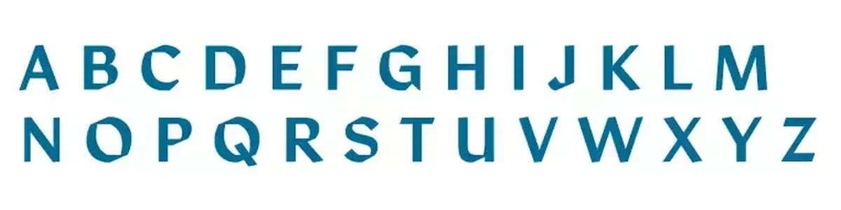
Adobe Fonts describes Manofa as inspired by Lydian, the calligraphic sans drawn by Warren Chappell. Mariya Lish started from experiments with one letter, the O, and built the rest around it. You can see that in the letters: the curves look cut with a broad pen, and many strokes end in a sharp angled slice instead of a round end.

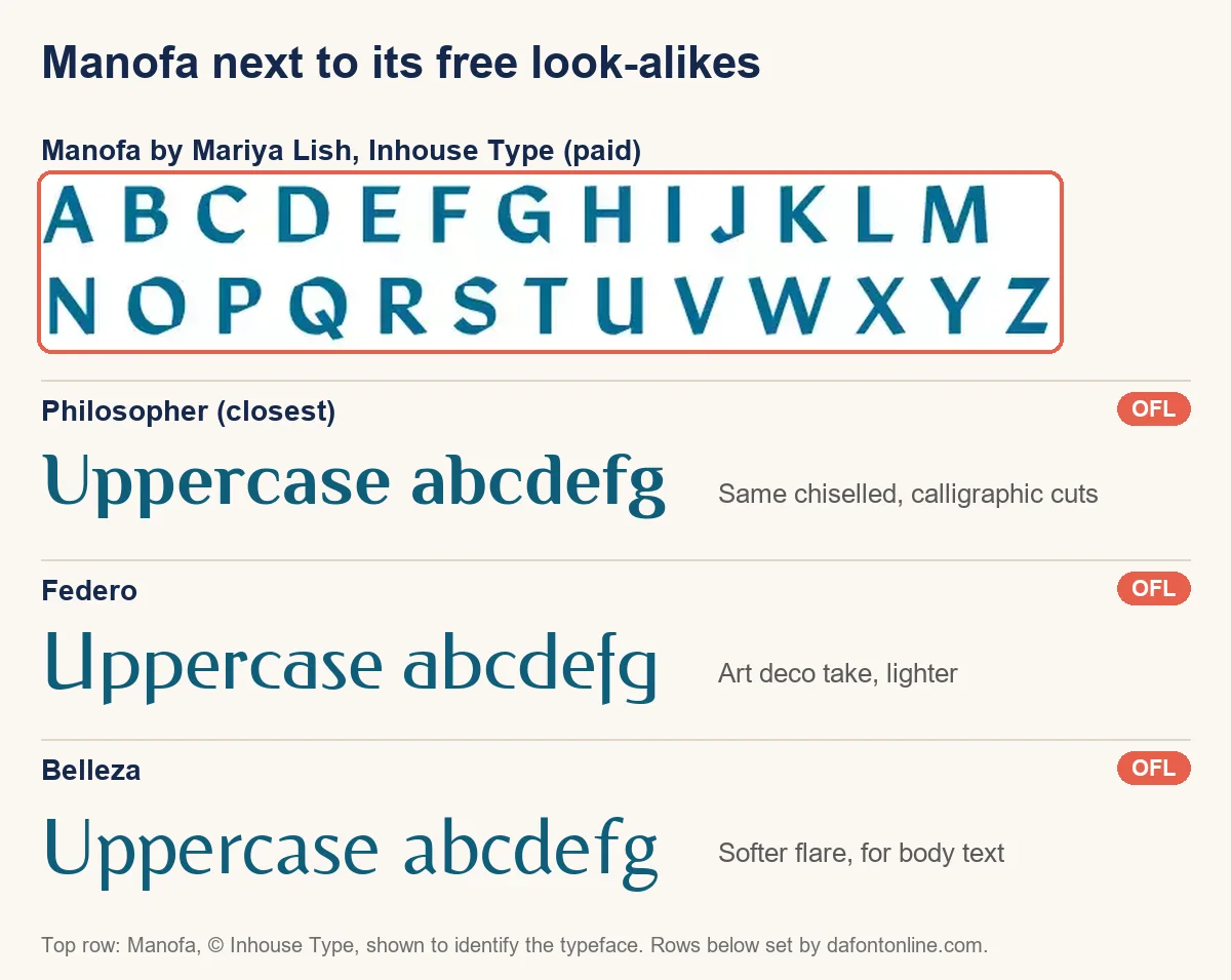
- Philosopher has the same pen-cut curves and angled ends. It’s the best free stand-in for headings.
- Federo is lighter, with an art deco flavour. Use it for elegant titles and labels.
- Belleza keeps a softer flare and reads well in paragraphs, so it pairs with either of the other two.
Sixteen styles, two widths
Manofa first came out through The Northern Block, under which Fontspring listed it, and is now sold by Mariya Lish’s own label, Inhouse Type. It comes in four weights (Light, Regular, Medium and Bold), each with an italic, in a normal and a condensed width. That’s sixteen styles in all, which is why it also works for body text and not only for logos.
Where to get the real one
Want to test it first? Inhouse Type offers free trial fonts for mock-ups and layout tests only. The trial terms forbid commercial use and sharing, so we can’t host it here. If you have Creative Cloud, turn Manofa on in Adobe Fonts and it appears in Photoshop, Illustrator and InDesign. Adobe Fonts covers personal and commercial design work, but Inhouse Type sells the licences for self-hosting and apps. Without Creative Cloud, MyFonts sells single styles or the whole family, and Fontspring has listed it under The Northern Block.
It suits gallery signage, book covers, wine labels and brand names that want a hand-made edge without looking like handwriting. For other fonts our readers look up, see the Cinzel font and the Ahsing font.
Manofa questions
Is Manofa free?
No. It’s a commercial font from Inhouse Type. It’s included in Adobe Fonts for Creative Cloud subscribers, and Philosopher, Federo and Belleza are free alternatives.
Who designed Manofa?
Mariya Lish designed it, and Inhouse Type publishes it.
What font is Manofa based on?
It takes its inspiration from Lydian by Warren Chappell, a calligraphic sans-serif, and reworks it with sharper modern cuts.
The short version
Check your Creative Cloud account first, because you may already have Manofa. If not, Philosopher gives you that pen-cut look for free.