





On this page
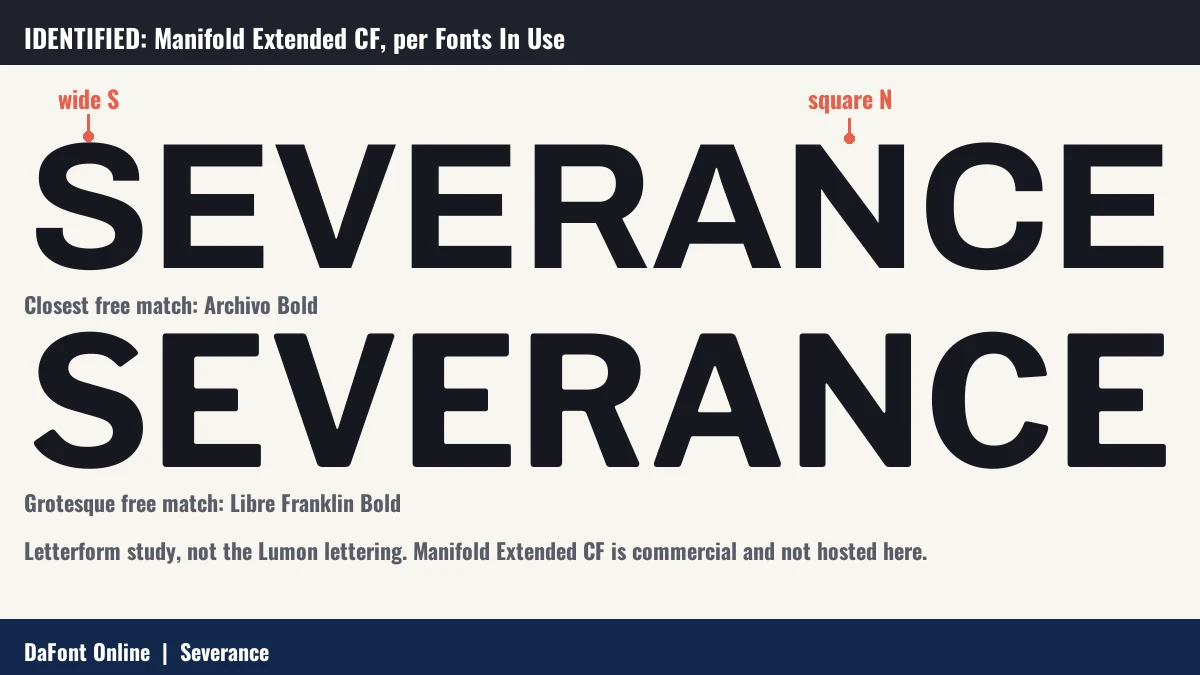
Quick answer: Fonts In Use lists Manifold Extended CF as the typeface used throughout Severance. Art of the Title credits the title design to Teddy Blanks. Free matches on this page: Archivo and Libre Franklin.

About the Severance font
Severance is an Apple TV+ series created by Dan Erickson. It premiered on 18 February 2022 (Wikipedia).
Fonts In Use records Manifold Extended CF as the typeface used recurringly in the series (Fonts In Use).
History of the Severance lettering
- 18 February 2022: the series premieres on Apple TV+ (Wikipedia).
- 8 April 2022: the first season ends (Wikipedia).
- 17 January 2025: the second season begins (Wikipedia).
Where the Severance font is used
- Recurring typeface across the series (Fonts In Use).
- Title design by Teddy Blanks, with main titles by Oliver Latta and extraweg (Art of the Title).
Free fonts similar to Severance
Archivo

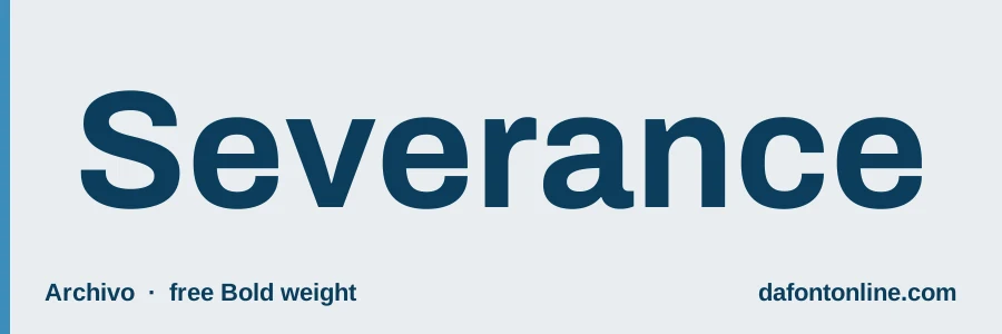
A wide variable font you can stretch toward Manifold’s wide look.
Libre Franklin
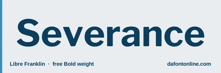
Neutral and corporate, like office signs.
Inter
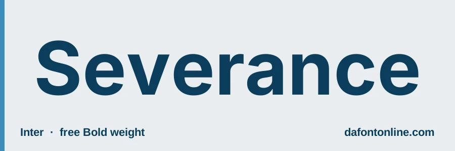
A clean modern sans for screens and menus.
Jost
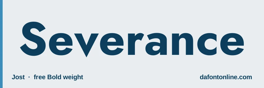
Geometric and calm, great for a quiet, sleek heading.
Marcellus
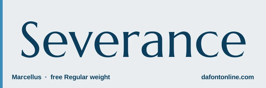
A softer serif, if you want something closer to Optima.
Each download is the original file from Google Fonts, shared under its open license (SIL Open Font License or Apache 2.0). You can use these 5 fonts free in personal and commercial projects.
Try the Severance look-alike fonts
-
Archivo Download font Open in Studio
- Format
- TTF
- Licence
- See the font page for the licence terms
Severance -
Libre Franklin Download font Open in Studio
- Format
- TTF
- Licence
- See the font page for the licence terms
Severance -
Inter Download font Open in Studio
- Format
- TTF
- Licence
- See the font page for the licence terms
Severance -
- Format
- TTF
- Licence
- See the font page for the licence terms
Severance -
Marcellus Download font Open in Studio
- Format
- TTF
- Licence
- See the font page for the licence terms
Severance
How to make Severance-style text
- Choose white text on a muted green, blue or gray background.
- Use wide letter spacing and all capitals for company names.
- Keep everything flat. No shadows, outlines or gradients.
- Write small corporate slogans like a memo, short and polite.
Try your own text in our font generator, or browse more free design tools.
FAQ
What font is Severance?
Fonts In Use lists Manifold Extended CF. Free look-alikes are Archivo and Libre Franklin on this page.
Is Manifold Extended free?
We did not check its licence. Archivo and Libre Franklin are free Google Fonts.
Who designed the Severance title?
Art of the Title credits the title design to Teddy Blanks (Art of the Title).