Marlboro Logo Font is a custom-made brand logo specifically for the Marlboro brand. Since they have the exclusive right, it isn’t available to the public. After thorough research, including on Reddit and the Dafont Discussion Forum, we found some fonts that are available on the internet that have similarities to the custom font used in the Marlboro logo. These fonts may have been inspired by or created to resemble the Marlboro logo font. Now we’re going to provide you with some useful information about each font and a download option, so you can easily incorporate them into your own designs. Get ready to add some serious cowboy swagger to your projects!
Neo Contact
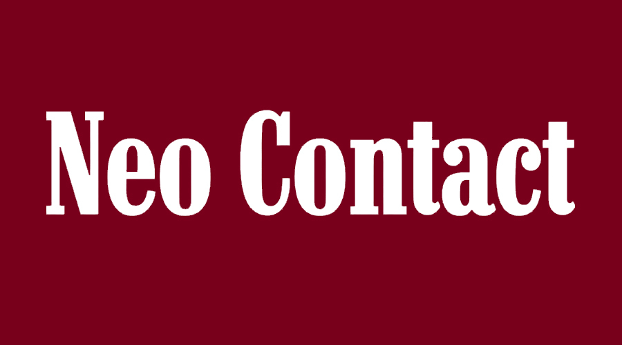
Neo Contact is a bold and condensed serif typeface. It was designed in a style, which is characterized by its sharp, squared-off serifs. The font is known for its high readability and distinctive characters. It is a versatile font that can be used for both headlines and body text, making it suitable for a wide range of design projects. The font has a strong, sturdy, and classic look that makes it suitable for formal and serious designs. It is a popular choice for headlines, book covers, posters, and packaging design. The font is also available in several variations, including a regular, bold, and italic version, which provides designers with more options for their projects.
Marlboro’s iconic logo shares a striking resemblance with Neo contact, from the sleek lines of their “M” and “N” to the bold “O” and balanced space – a true testament to the timeless design.
This isn’t a free font so you have to buy it from the vendor to use it. And you can start the purchase process by clicking the link below. But if you are looking for free ones to use then keep reading below!
The Marlboro Font
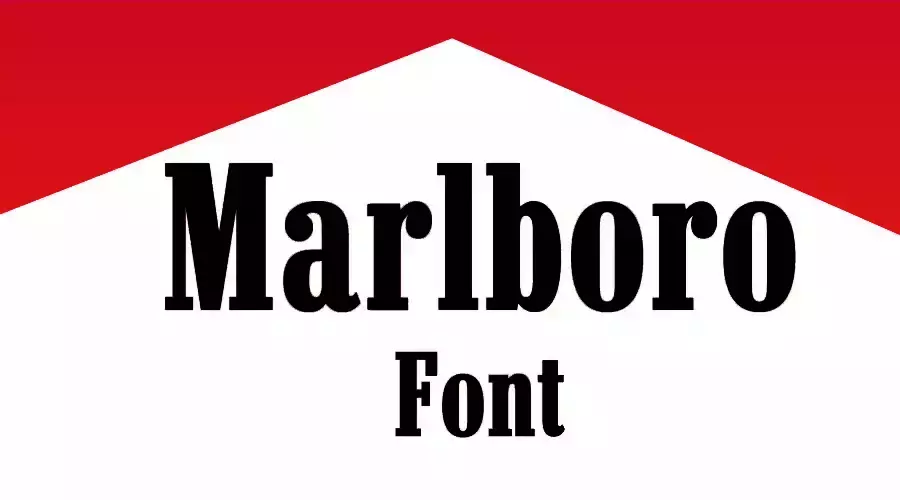
The Marlboro font is a slab serif typeface that was inspired by the logo for the Marlboro brand of cigarettes. German typographer Dieter Steffmann in 2003 designed the font, and it is similar in style to the serif font used in the Marlboro logo. The font is copyrighted under the name “Typographer Mediengestaltung.” The Marlboro font was designed to mimic the style of the Marlboro logo, which is known for its rugged, western-inspired typography. The font was created to align with the brand’s image and to be used in packaging, advertising, and other branding materials to create a cohesive, recognizable visual style. The Marlboro font is characterized by its strong, bold lines and squared-off serifs, which give it a distinctive appearance.
Even though they look similar, they do have some differences. One of them is, Marlboro’s logo has taller “l” and “b” letters compared to the other letters in the logo.
This is a completely free font for both personal and commercial use. So, all you have to do is click the download option and then start using it immediately!
Century Schoolbook
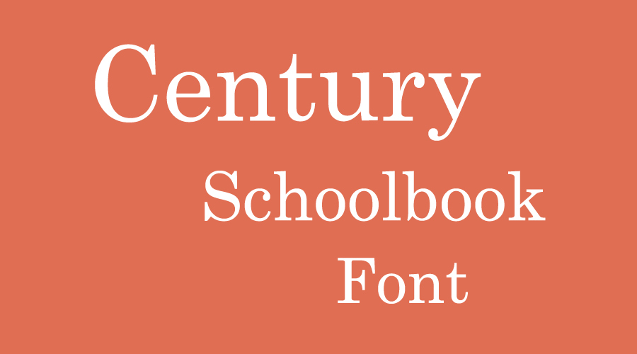
Century Schoolbook is a serif typeface designed by American type designer Morris Fuller Benton and published by Ginn and Company. The font is known for its readability and attractive, appealing characteristics, making it a widely used typeface around the globe. This font is a transitional font that is not suitable for business websites, but it’s great for making text prominent and easy to read. The bold and italic weights of this typeface are commonly used, and it can be used in combination with ethnocentric fonts to create great designs.
Century Schoolbook font is free to download for personal use but a license is required for commercial use.
Since we have been talking about Marlboro-inspired fonts it’s obvious that you are curious. So, we will tell you a brief history of Marlboro
Origin and History of Marlboro
Marlboro is a brand of cigarettes owned and manufactured by Philip Morris USA, a division of Altria Group, within the United States, and Philip Morris International outside the US. The original logo for Marlboro was designed in 1924 and stayed with the brand for only four years. The iconic logo for the American tobacco brand we all know was designed in 1932 and barely changed by today. The bold and condensed serif type featured in the emblem is perfectly readable and doesn’t look offbeat. Probably the most characteristic characters are “a” and “r”. The font is called Neo Contact.
The brand was first introduced in 1924 and was originally marketed towards women, with the slogan “Mild As May.” But sales were not strong in the 1950s. So, the brand was repositioned to target men with a rugged, masculine image, using the iconic Marlboro Man as a symbol. As of 2017, Marlboro had a 40% market share in the US.
Thank you for reading!