






On this page
The Moon Knight logo does not use a public font. The lettering was made for the Disney+ series, so you cannot download that exact style. The two closest matches are Lemon Milk, a bold geometric sans serif, and Moon Fark, a connected script with a similar energy.
About the Moon Knight font
Moon Knight is a Marvel superhero series that premiered on Disney+ in 2022. It follows Marc Spector, a man who becomes the vigilante Moon Knight. In the story, he is possessed by Khonshu, an ancient Egyptian moon god, and that link shapes how he fights crime.
Fans started searching for the font as soon as the logo appeared. The lettering was made for the show and is not sold as a public font, so most people turn to a close match instead.
The look appears in the logo and in merchandise. A close match helps when you want a fan poster, a card or a banner that feels like the show.
Logo fonts work best when you match the mood and the shape of the letters. Look at the curves, the spacing and the weight before you decide. A font that looks right in a small test can look crowded on a poster, so check it at the size you plan to use.
The Fonts Behind Moon Knight
Two fonts come closest to the Moon Knight lettering. Compare the image below with the logo and keep the one that fits your project.

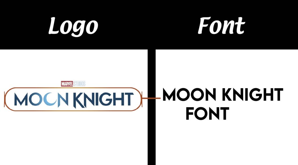
The first pick is Lemon Milk by Marsnev. It is a contemporary geometric sans serif. Its heavy strokes and firm shapes make it a good choice for headlines, logos and posters.
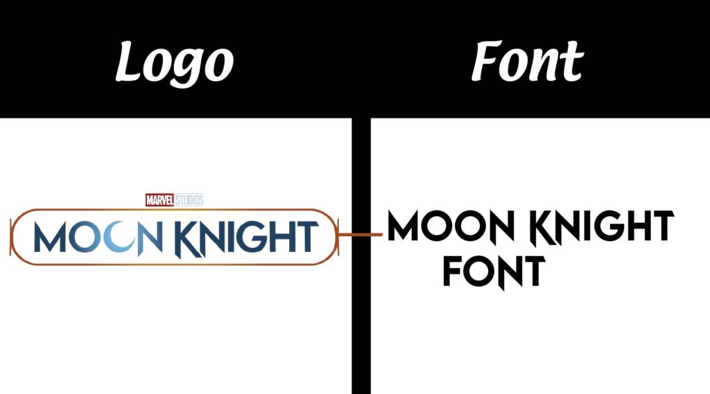
The second pick is Moon Fark by Goova Studio. It is a script typeface with interconnected letters and a dynamic flow, which is close to the energy of the Moon Knight logo. Put the two images side by side to see the difference. Script letters are harder to read at small sizes, so Moon Fark suits titles and short phrases more than long body text.
Check the license before you use Moon Fark in paid work. A free download does not always cover commercial projects, so read the terms that come with the file.
Font Generator
Type your own word and compare it across the Moon Fark font and the Lemon Milk weights. The tester includes several Lemon Milk weights and italics, so you can see how the family changes from light to bold.
Try a short word first, then a full title. Short words show the letter shapes clearly, while longer lines show spacing and how the letters work together.
-
MOONFARK goova studio Download font Open in Studio
- Format
- TTF
- Licence
- See the font page for the licence terms
moon Knight -
LEMONMILK Regular Download font Open in Studio
- Format
- OTF
- Licence
- See the font page for the licence terms
moon Knight -
LEMONMILK RegularItalic Download font Open in Studio
- Format
- OTF
- Licence
- See the font page for the licence terms
moon Knight -
LEMONMILK Medium Download font Open in Studio
- Format
- OTF
- Licence
- See the font page for the licence terms
moon Knight -
LEMONMILK MediumItalic Download font Open in Studio
- Format
- OTF
- Licence
- See the font page for the licence terms
moon Knight -
LEMONMILK Light Download font Open in Studio
- Format
- OTF
- Licence
- See the font page for the licence terms
moon Knight -
LEMONMILK LightItalic Download font Open in Studio
- Format
- OTF
- Licence
- See the font page for the licence terms
moon Knight -
LEMONMILK Bold Download font Open in Studio
- Format
- OTF
- Licence
- See the font page for the licence terms
moon Knight -
LEMONMILK BoldItalic Download font Open in Studio
- Format
- OTF
- Licence
- See the font page for the licence terms
moon Knight
Font View
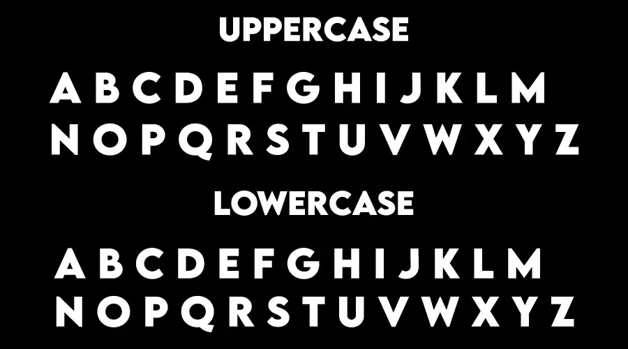
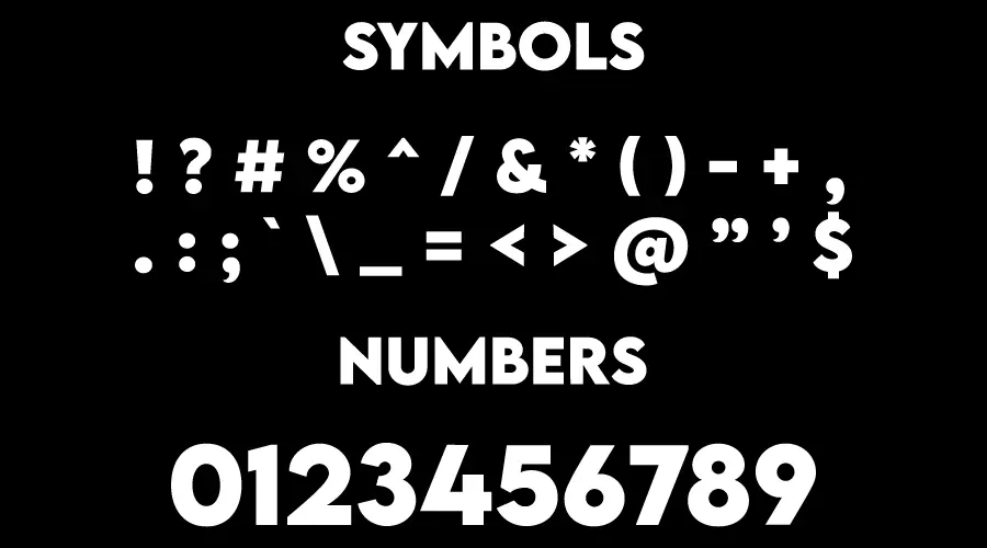
The images below show the character and symbol art linked to the Moon Knight look. Use them to judge the mood before you pick a font.
Look at how the lettering sits next to the artwork. A bold font can feel right on a poster and too heavy on a phone screen, so test both sizes before you settle on one.

How to use the Moon Knight font
On Windows, download the font file, right-click it and select Install. Restart your design app if the font does not appear in the list.
On a Mac, double-click the font file and choose Install Font in Font Book. Lemon Milk comes in several files, so install only the weights you plan to use.
In Canva, open the font menu and search for the font name. If it is missing and your plan allows uploads, upload the font file. If not, type the text in a desktop app, export a PNG and place it in your design.
Fonts similar to Moon Knight
FAQ
What font is the Moon Knight logo?
The logo uses custom lettering made for the Disney+ series. It is not sold as a public font. Lemon Milk and Moon Fark are the closest matches on this page.
Is Lemon Milk the official Moon Knight font?
No. Lemon Milk is a separate font that looks similar to the logo. It is a close match, not the font used in the show.
Can I use these fonts for commercial work?
Check the license for each file before commercial use. Lemon Milk and Moon Fark may have different terms, so read the license that comes with each download.
Which Moon Knight style should I try first?
Start with Moon Fark if you want the flowing, connected feel. Choose Lemon Milk if you need a bold, sharp headline.