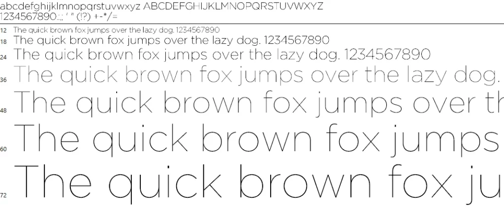
If you want a refined and sophisticated touch for your next design project, look no further than the Gotham Thin font. Created by Tobias Frere-Jones in 2000 and released two years later by Hoefler & Co., Gotham Thin is the lightest weight in the Gotham family of sans serif fonts. It draws inspiration from the architectural signage of New York City, resulting in a clean and modern design that is versatile for various purposes.
Gotham Thin Characteristics
Gotham Thin has a minimalist and uniform design with consistent stroke widths. Some letters have rounded corners that soften their appearance. Gotham Thin has a balanced and harmonious look with a high x-height and low contrast between horizontal and vertical strokes. Its subtle features, like the curved tail of the Q, the angled crossbar of the G, and the square dot of I, add character to the text.
Where to Use Gotham Thin
Gotham Thin is suitable for various purposes that require a refined and sophisticated touch. It can be used for logos, headlines, magazines, books, websites, posters, flyers, and banners. Pairing it with other fonts that complement its style, such as serif or display, can add depth to your design. Neutral and pastel colors match its lightness and elegance.
Gotham Thin Font Generator
Font View

Font Information
| Full Font Name | Gotham Thin |
| Version | Ver-1.00 |
| Created & Modified Date | January 22, 2006 |
| Copyright | HTF Gotham\252 Corp. 2000 The Hoefler Type Foundry, Inc. Info: www.typography.com |
| Designer | Tobias Frere-Jones |
| Unique Font Identifier | Gotham-Thin:1162597748 |
| Glyphs | 225 |
| Characters | 223 |
| Classification | sans-serif |
| Type | TrueType and OpenType |
License Information
It is also assessable for commercial purposes. However, purchasing a commercial license is strongly advised for commercial use.
Similar Fonts to Gotham Thin
Eng Gothic Thin, Gothic 57 Thin, and Thin are some fonts that share similarities with Gotham Thin. Eng Gothic Thin is a geometric sans serif font with a futuristic and industrial look, while Gothic 57 Thin has a classic and timeless style. Thin, created by Dharma Type, has a minimalist and elegant style that is delicate and graceful.
Conclusion
For a sleek and elegant text look, Gotham Thin is an excellent choice. It is easy to use and customize, making it suitable for various projects. With its clean and modern design inspired by New York City’s architectural signage, Gotham Thin can make your design stand out. So why not try it for your next design project?
If you liked this font and looking for more new fonts then check out our Cloudsters Regular, Ahsing, and Horizon fonts!
Thank you!
