

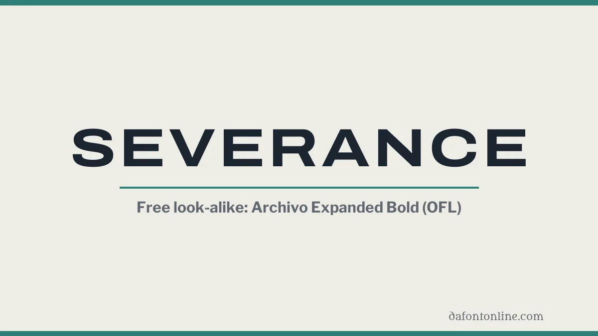
Quick answer: Typeroom, citing the Severance Wiki, says Lumon’s corporate typeface is Manifold Extended CF. We do not host it. No source we read names the typeface of the title sequence. The nearest free matches are Archivo Expanded and Libre Franklin, both under the SIL Open Font License 1.1.
On this page
About the Severance title sequence
Severance is an Apple TV+ series. Its opening title sequence was made by Oliver Latta, who works as Extraweg. Typeroom says the title credits carry typography by Teddy Blanks, and that the sequence won the 2022 Creative Arts Emmy for Main Title Design.
Which fonts Severance uses
Typeroom summarises the Severance Wiki’s typography page. It lists these typefaces in the show:
- Manifold Extended CF: Lumon Industries’ corporate typeface. Fonts In Use also lists it as recurring across the series.
- Forma DJR: part of Lumon’s house style.
- Optima: the Compliance Handbook volumes in the Macrodata Refinement department.
- Input Sans: the text of the Compunction Statement.
- Scriptorama Tradeshow JF: the Lumon Recycles bins.
We host none of these five. Where we checked, the licence was paid or allowed personal use only.
The title sequence’s typeface is a separate question. Typeroom reports that on Reddit’s Identify This Font thread, the guesses included Helvetica, Suisse Int’l and SF Pro. None was confirmed.
Free fonts that look like Severance
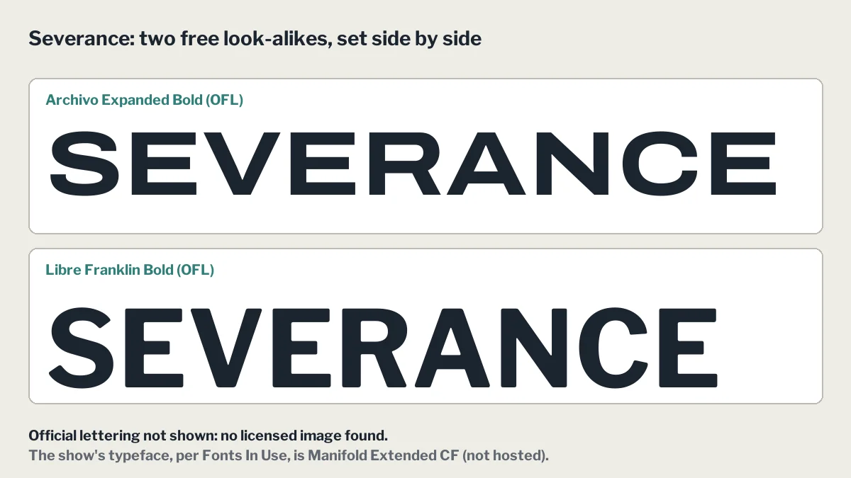
Archivo Expanded
Archivo is a grotesque family with a wide width axis. This file is its expanded width at Bold weight, cut from the official variable font, so the capitals are wide and even, like the Manifold-style letters the show uses. It is a look-alike, not the same typeface.
Libre Franklin
A neutral grotesque, closer to plain office signs than to the wide letters of the title. Use it for body-size lines next to a wide heading.
Both fonts are licensed under the SIL Open Font License 1.1, which allows commercial use.
We do not host Manifold Extended CF, because its full family is sold commercially.
Try the look-alike fonts
-
Archivo Download font Open in Studio
- Format
- TTF
- Licence
- Free for commercial use
- Made by
- Omnibus-Type
- Source
- fonts.google.com
SEVERANCE -
Libre Franklin Download font Open in Studio
- Format
- TTF
- Licence
- Free for commercial use
- Made by
- Impallari Type
- Source
- fonts.google.com
SEVERANCE
FAQ
What font is Severance?
Typeroom, citing the Severance Wiki, names Manifold Extended CF as Lumon’s corporate typeface. No source we read names the typeface of the title sequence.
Is there a free Severance font?
Archivo Expanded and Libre Franklin are free under the SIL Open Font License 1.1. They are look-alikes. Manifold Extended CF is not hosted here.
Who designed the Severance title sequence?
Typeroom credits Oliver Latta, who works as Extraweg, with creating the sequence, and Teddy Blanks with the typography.